![Curaytor Logo horizontal - Color-Feb-12-2025-12-24-20-8194-AM.png]](https://help.curaytor.com/hs-fs/hubfs/Curaytor%20Logo%20horizontal%20-%20Color-Feb-12-2025-12-24-20-8194-AM.png?height=40&name=Curaytor%20Logo%20horizontal%20-%20Color-Feb-12-2025-12-24-20-8194-AM.png)
Bad design can sink your content. You may have written the best blog post in the world, but with crummy design, readers will bounce long before they realize it.
Good design gets out of your content’s way. It lets your readers and viewers focus on what you’ve created.
Great design propels your content forward. It jumps off the page and helps the content stick in the reader’s mind. They’ll engage with it in a much more dynamic way.
You’ll learn about: Contrast, Color, Typography, Visual Harmony, and Minimalism. With these core concepts, you’ll be better fit to make good design choices.
The 5 core concepts for better design
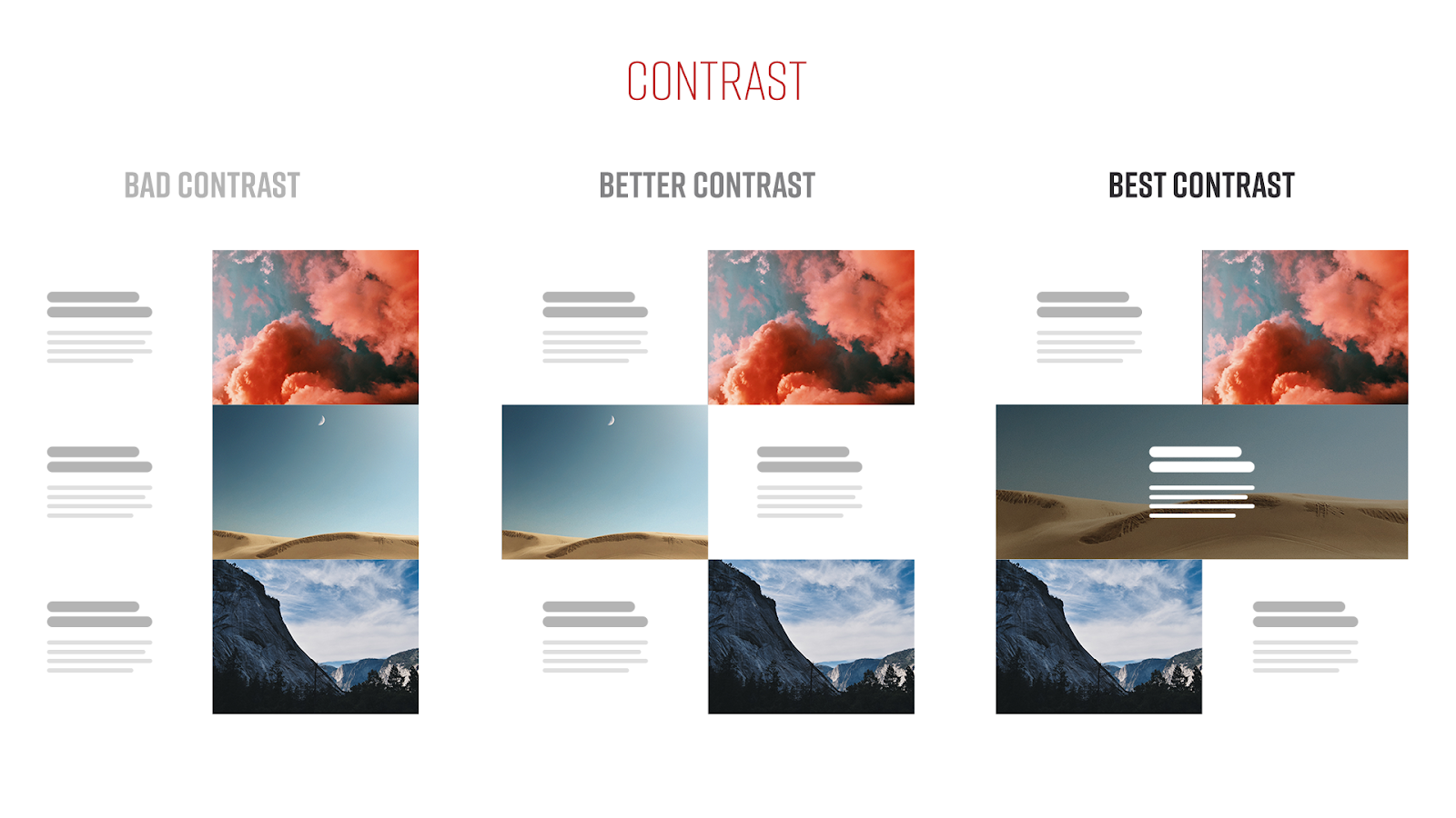
1. Contrast
Contrast is a key element in making both attractive and functional designs. Contrast is all about harsh differences between objects. What you want to avoid is using the same object over and over again, in the same way on a single page. Eye fatigue is a real thing in modern design.
Our platform’s objects have variants, which help greatly in battling eye fatigue. Even just alternating a single object’s orientation can work wonders and it takes almost 0 effort to do. Align left, align right, and align center. People often skim and don’t read. That’s similar in design; if everything looks the exact same, visitors will just breeze through a page without actually looking at it. And while that might get us good number for time on site, it doesn’t help establish trust.
2. Color Theory
Color theory is an important piece of the puzzle, but one that’s really easy to mess up. There are a lot of rules and ways to pair colors but real-world applications will usually only use a single primary color, and sometimes a complementary secondary color. Variations in both shade and tint, both dark and light, of the primary color will help tie your color composition together while still maintain a strong contrast
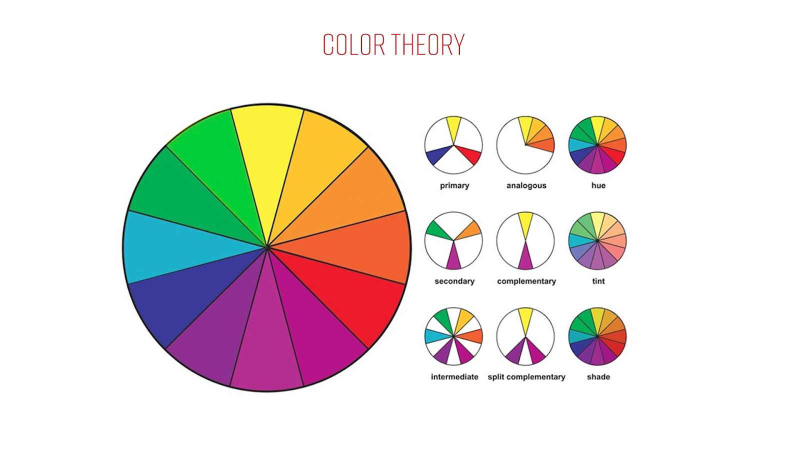
A simple rule to follow is to use near blacks. Whatever your primary color is, the near black would a very, very dark version of that same color. It’s much softer on the eye and unless put next to actual black, it will still read as black.
An extra tip to help break up your content is to use subtle off-whites. If you think your page is too stark and boring, make an object’s background color #fafafa or #f3f3f3. You’ll maintain readability and still make that object have a clean break from the one above and below it.
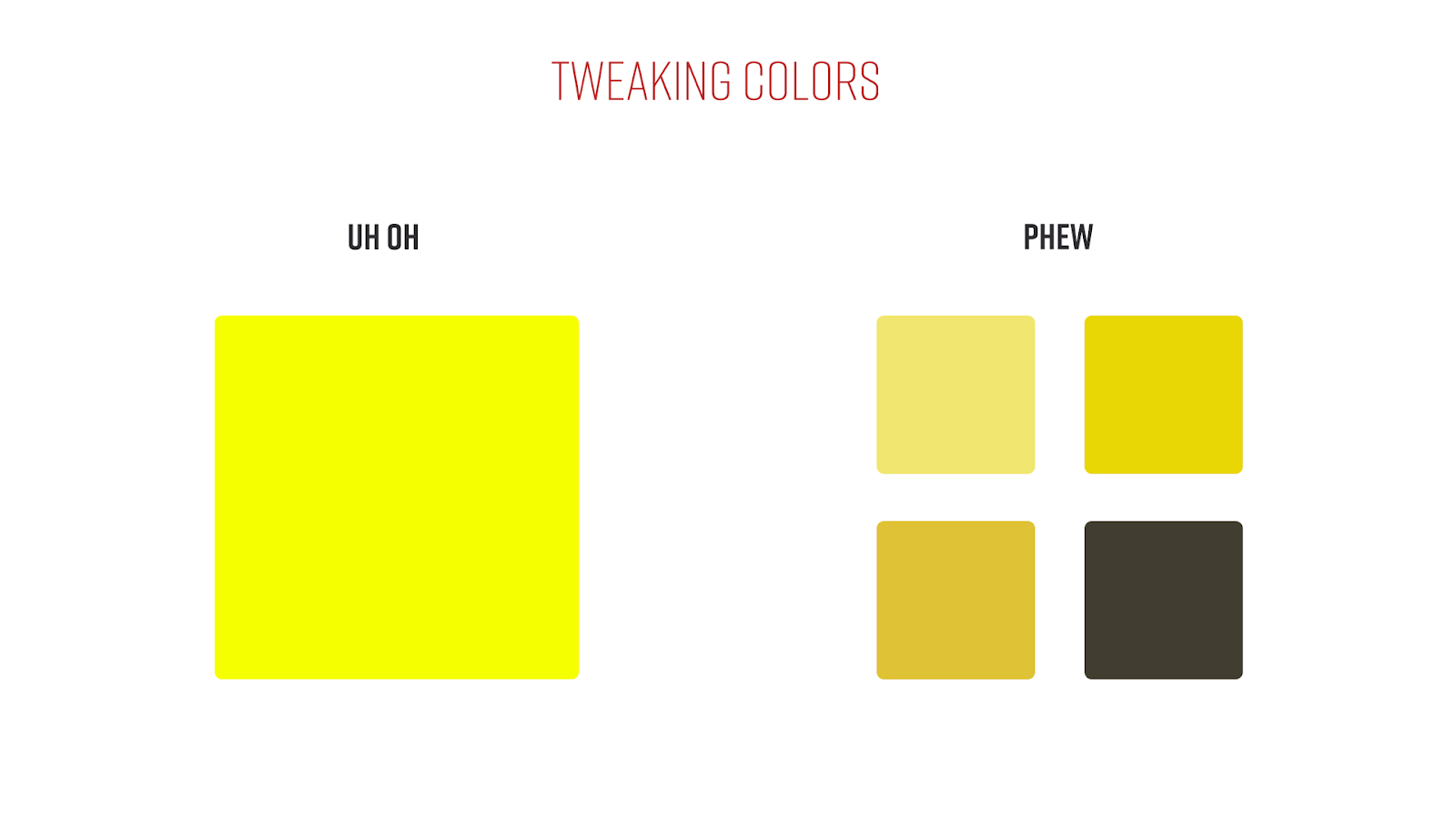
In practice: Bright colors might work well in your branding, they call out attention and help describe who you are, but they don’t always work for a button or primary color on a site. It’s okay to tweak your brand color just a little bit, to make it easier to read and help conversion.
There are a few ways to going about doing this but the easiest is to just pull up a website with a color wheel.
Here are two that I like:
What I like about these sites:
1. Colormind gives you an example website with context so you can see how good (or terrible) your color choices are.
2. Paletton helps you find additional colors automatically.
A final note about color is that there have been many studies on the psychology of color and the ruling is generally, take it with a grain of salt. People are wildly different and we work with people in a lot of places. These things greatly influence how someone may feel about a certain color.
3. Typography
Font Pairing
An important aspect of typography is picking which fonts work together and which don’t. There are, generally, two kinds of typefaces.
Serif fonts have tiny decorative lines on the ends of a character. Times New Roman is a good example of a serif.
Sans Serif fonts simply don’t have additional embellishments on the ends of a character. Helvetica is a good example of a sans serif.
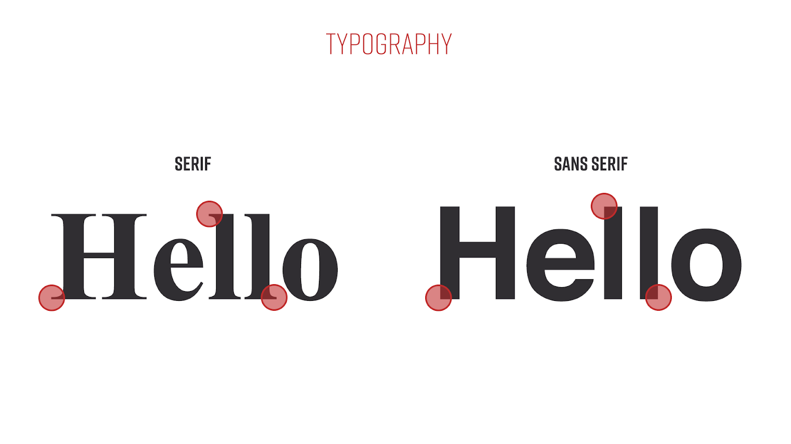
A simple rule of thumb is to pair a serif, and a sans serif together. The contrast between these two kinds of fonts often makes really beautiful pages almost by themselves.
You can mix the same kind of fonts together as long as they still have a stark contrast. A good example of this would be a tall uppercase sans serif font like Oswald and a more traditional sans serif font like Source Sans Pro. Some fonts can be used with themselves but usually, a single font design lacks dynamic appeal. A good example font would be Roboto.
Type Hierarchy
Not all typography should be the same size, especially when one is clearly less important than the other. When we have a headline and subheadline, it’s important to remember contrast and make sure the headline is noticeably bigger than the subheadline. An example would include a Headline being 48px and a Subheadline being 36px.
Type Hierarchy is essential in pages. Not every headline on your objects should be equal, but sectioned off into H1s - H6s (though realistically it's Headline 1 - Headline 3). It’s why the sizes are so different in our back-end. If you do end up breaking out your content into the full H1-H6, there are a few tricks to help keep the text from getting too small. When you start to linger down to the H5 it's almost the same size as the body copy. To differentiate it, you can use ALL CAPS or bold.
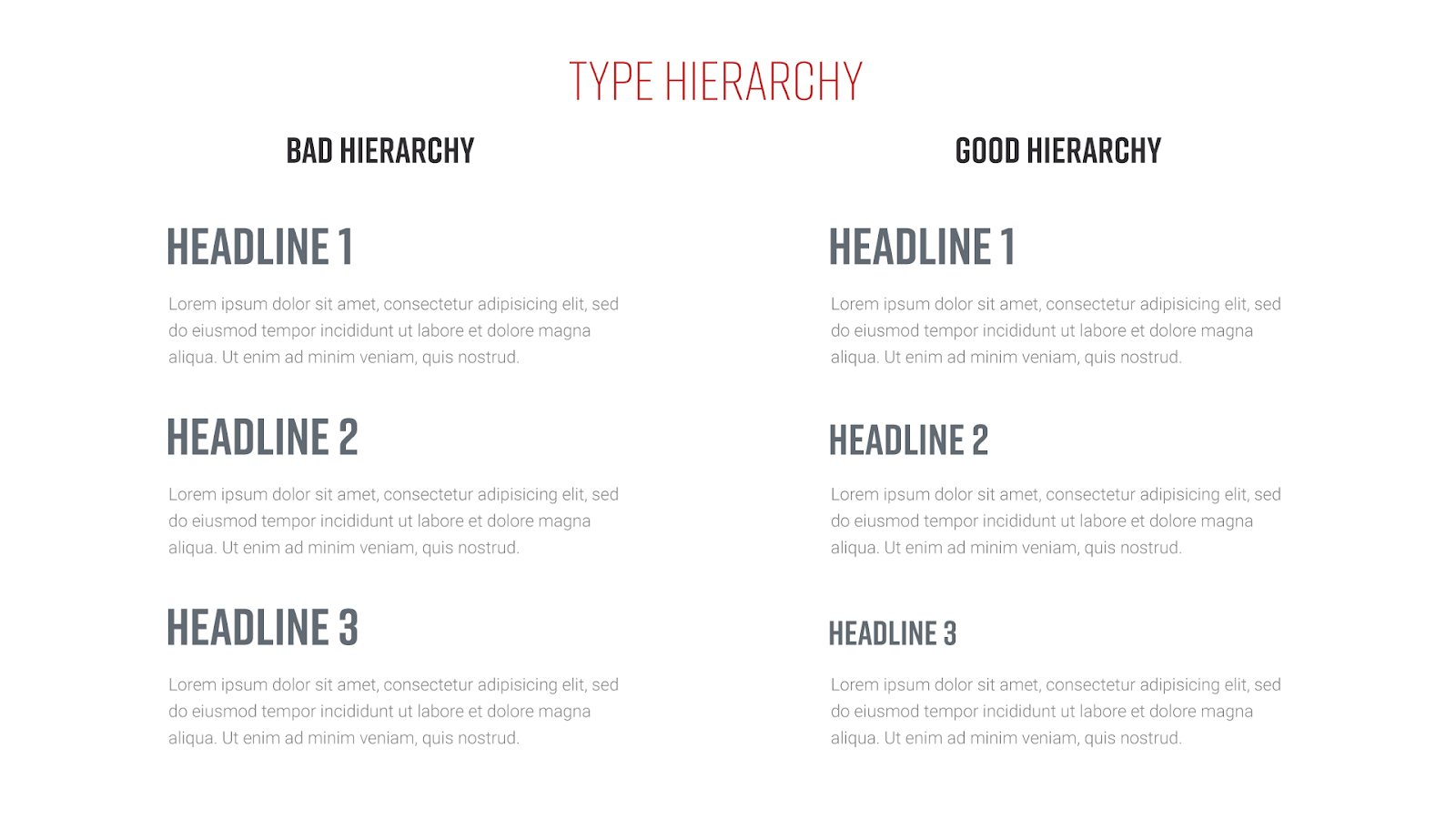
Type Hierarchy is more than just setting it once, but being mindful to keep it consistent throughout the entire site. You do not want each page to have its own set of rules. This will only confuse visitors and sometimes annoy them. This is all about helping to break up the content into easily understood sections to make it effortless to consume.
4. Visual Harmony
Visual harmony is tied very closely to type hierarchy. It’s all about keeping things as consistent and balanced as possible.
Full Width vs Container Width
On the new curaytor platform, you have a lot of choice. One of which is full width vs container width. Some of our objects shine in full width, but most don’t. This has a lot to do with how our eyes track content. If your object is just a headline with body copy below it, do not make it full width. The theory is that any single line of text shouldn’t exceed 60 characters. I think that’s a little harsh but the concept is sound. I oftentimes employ padding on the left and right to shorten the distance our users eyes need to travel. It may seem like overkill but it can make or break whether or not a visitor reads the content at all.
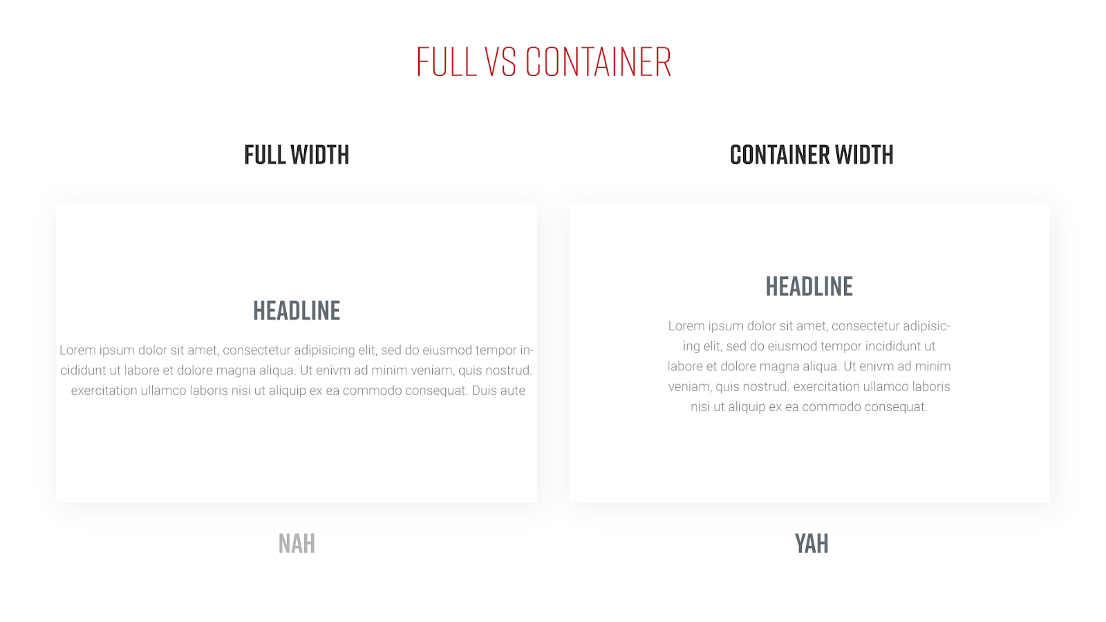
Most importantly: keep it consistent. If one of your regular text objects uses container width, they all should.
Whitespace
Never be afraid to let your objects breathe. In today's modern design world, there is no fold. Users scroll, it’s all second nature now. So don’t cram things on the page just to keep it short.
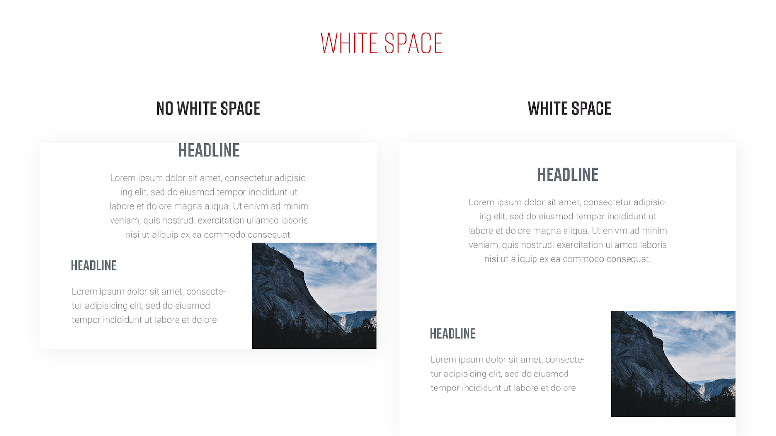
In practice I enjoy anywhere between 60 and 100 pixels between objects. There are exceptions to these rules but it’s a great starting place. You can add padding (whitespace) to any of our objects.
Most importantly: keep it consistent. If you choose 60, make sure you use it on every page.
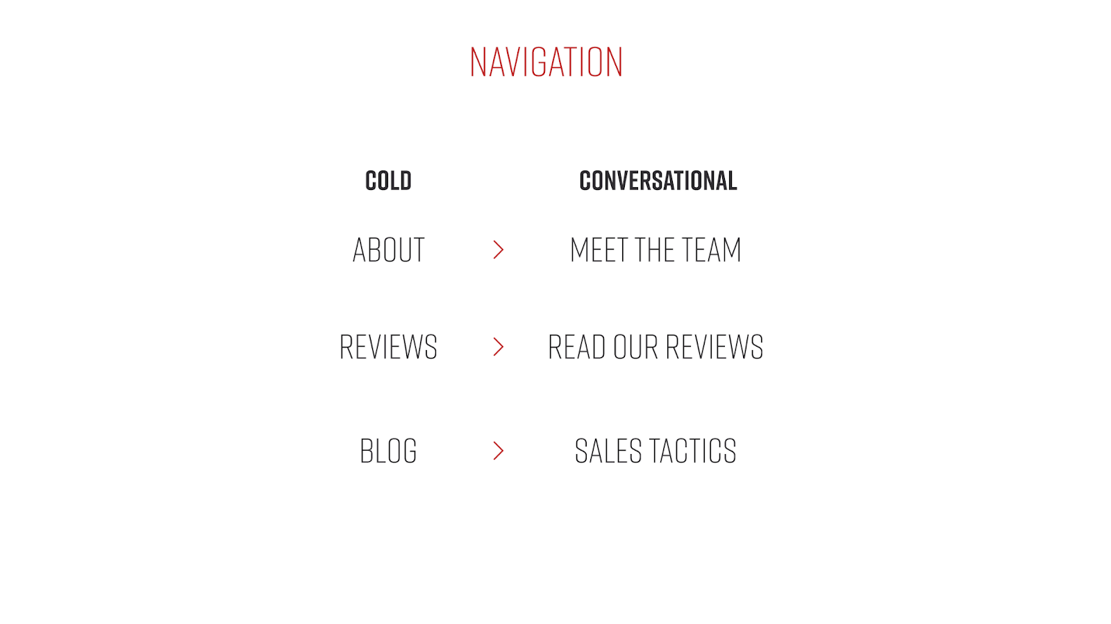
Navigation
Navigation is a crucial piece of tying all your pages together and keeping harmony. It might seem obvious, but there is more strategy here than you might think. It boils down to 2 things: verbiage and organization.
Verbiage
Sometimes just using ‘About’ to describe the about page is enough but ‘Meet the team’ is much stronger. It carries a more conversational tone which gets more clicks than the cold ‘About.’
Organization
We like to think of this as buckets. Most websites aren’t cut and dry with just a handful of pages. So you need to upgrade your strategy and organize all your content into buckets, pillars, sections, whatever, or it will get really hard for visitors to find their way around our sites. Even worse, they might just never find the content you want them to see.
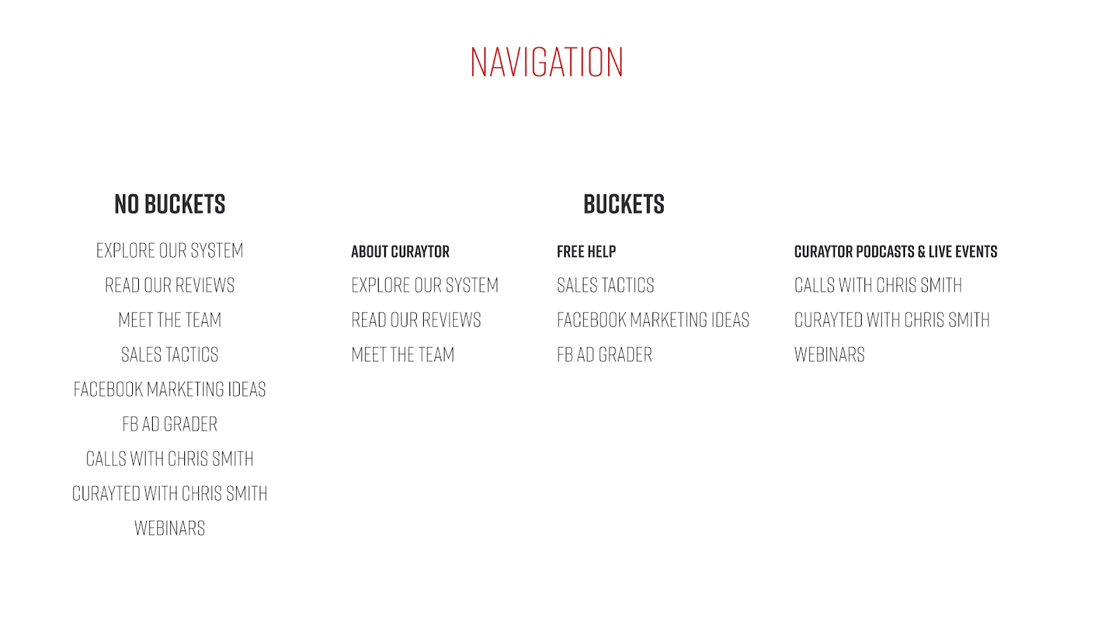
Another aspect to keep in mind is your MOST important links. You have a few spots that are always visible on our navigation. Use them! And don’t be afraid to change them when you have something new that's really important.
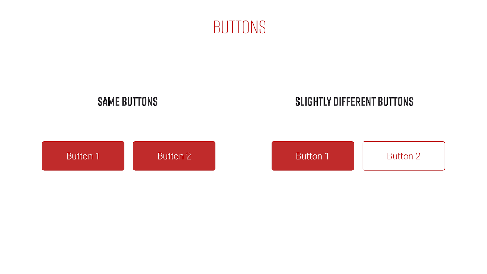
Buttons and Other Calls to Action
Buttons and other visual differentiators for CTAs are a huge part of modern visual design. They cannot be an afterthought (though it’s very easy to do just that). Buttons are tied directly to Color Theory and Visual Harmony.
You’ll want a few styles in your arsenal to use when you have competing buttons. One will always be more important than the other and having them look exactly alike will hurt conversion. The easiest way is to have a solid button and an outline one. Solid has that hefty weight to it that draws the eye, while the outline is just understated enough to grab attention after the first. They look different but have enough similarities to tie them together.
Another aspect is Calls to Action in general. These include buttons but have additional context like headline and sometimes subheadline. A few best practices include always bookend a page with a CTA of some kind, whether it’s taking the visitor to your contact page or moving them to another large section of your site like the blog or reviews page. Sometimes you’ll even want to pepper one in the middle of a really long page - some people are sold before they reach the bottom.
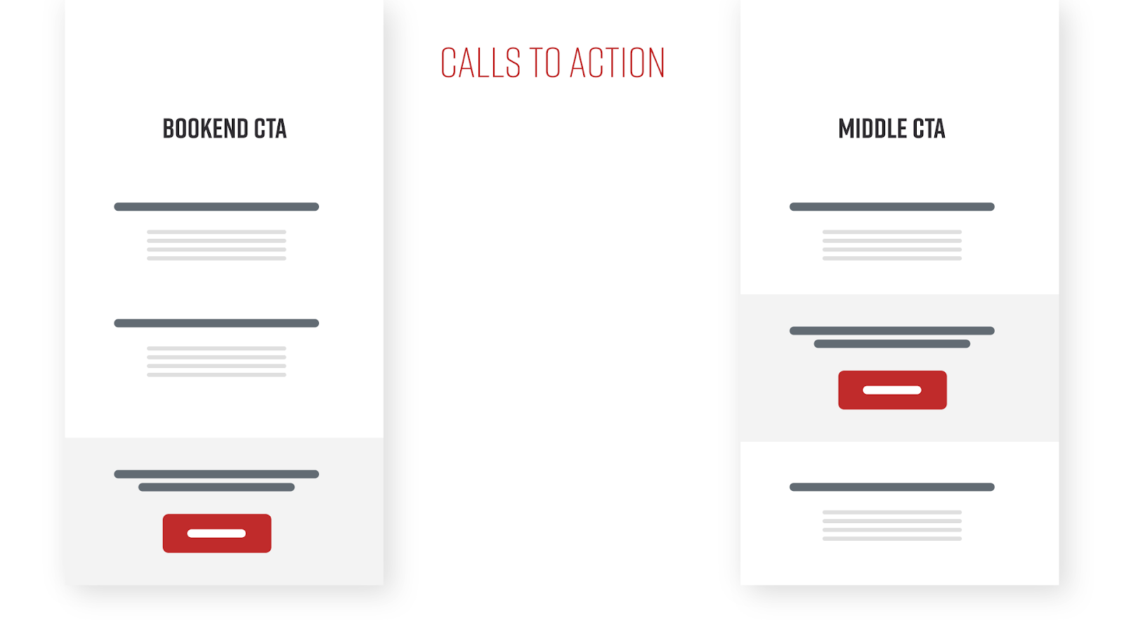
Most importantly: keep it consistent.
5. Minimalism
Less is more. It couldn’t be more important in modern design. This goes beyond just the Facebook 20% rule. The more you jumble up your designs and pages, the less anyone will want to look at it. That doesn't mean you can’t embellish the elements you do have, things don’t need to be stark and boring. Minimalism is an exercise more than a skill. While you’ll eventually come to a point where it’s natural, there is nothing wrong with placing too much on a page and then slowly pulling out the bits that aren't necessary.
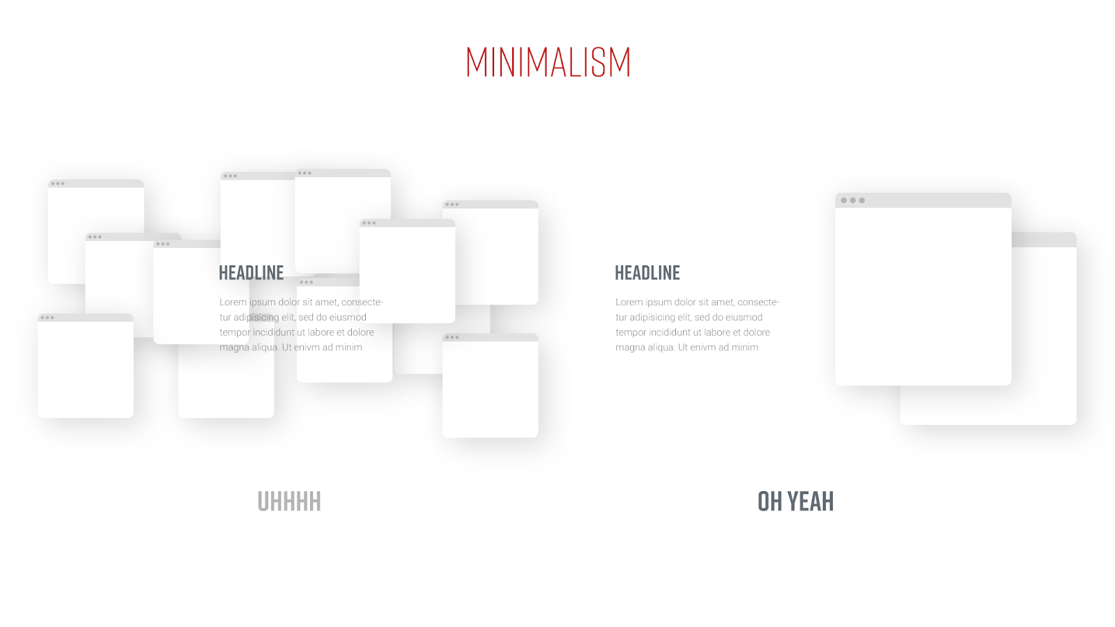
Think to yourself, “Is this piece of this page absolutely necessary to the message?” A lot of times, that’s a yes, but if it’s not, get rid of it. Better to keep your page free of distractions and let our readers get to the good stuff that they actually clicked on this page for.
I know I’ve said damn near each of these are a key or important piece of design, but the truth is, if you neglect even one of these, your visual design could be compromised and things can look off. Design, in general, is a practice as well as a skill. You won’t be the best at it overnight but over time these concepts will become second nature. Even over the past 5 or so years I’ve been at Curaytor, I’ve improved more than I thought I would, without really trying to. The key is doing and doing often.
A final note I’ll leave you with is to try and find something creative in your offtime. It doesn’t have to be related to what you do. Any creative outlet that you indulge in will help open up your creative channels in your work as well. You won’t regret it.